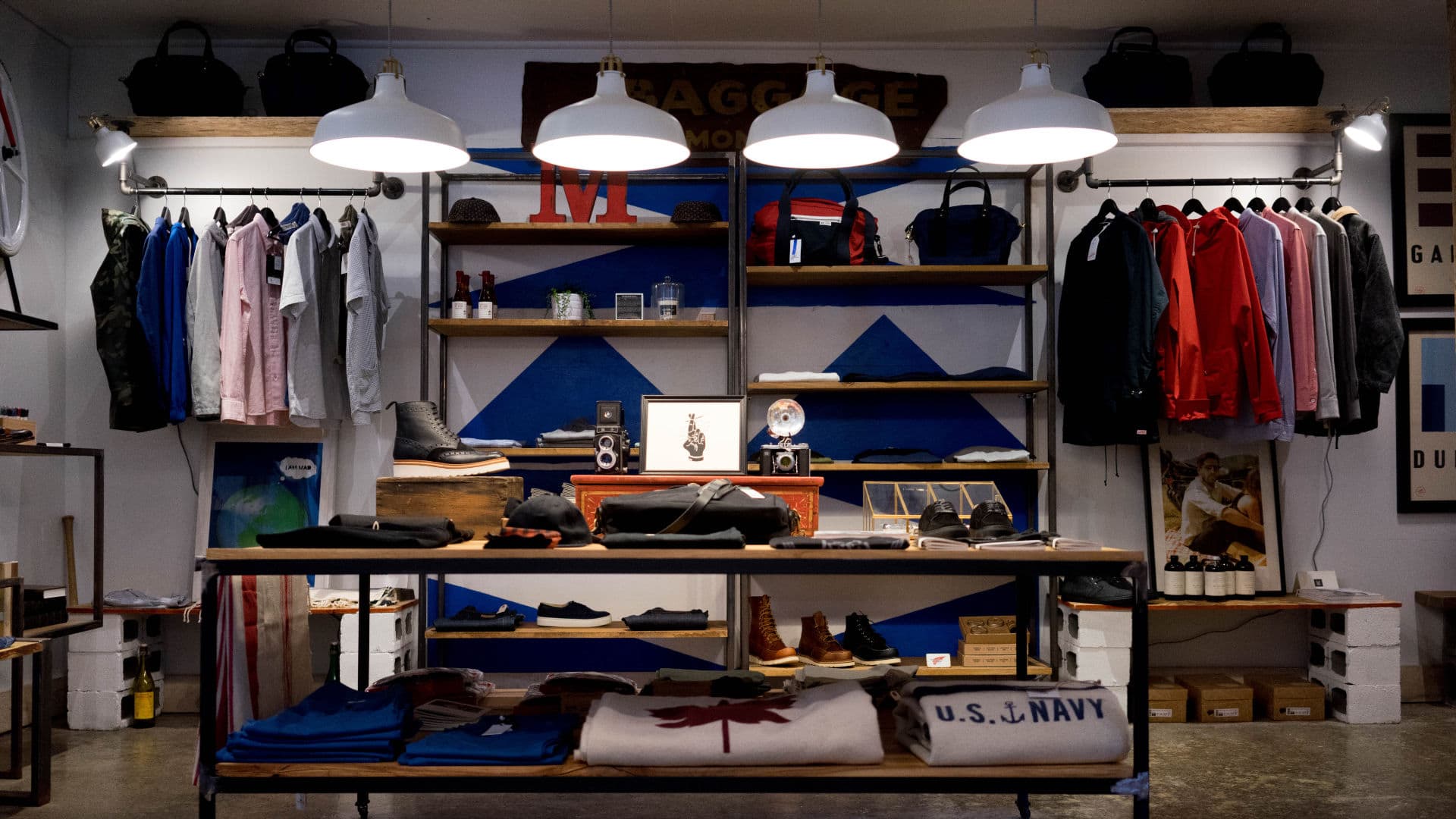
The single post has been styled to provide a bold introduction, large featured image and clean easy to read content. Starting with a custom hero header and finishing with a related posts section. It should provide all you need to create categorised post content to support your shop. All of the custom features are 100% dynamic you simply need to:
- Write your post
- Add a manual excerpt
- Select your featured image
- Give it a category
A note on Categories: The custom post navigation and related posts section displays content based on the current posts category. It uses the first Category assigned to the post. So if you choose to assign a post to multiple categories it will only query the first category.
The hero header
The single post header is quite a complicated set-up. Using four separate GeneratePress Elements. Including 2 hooks, a featured image header and a layout element. There is nothing the user needs to do for this to be displayed or dynamically updated.
The basics
Before diving into the detail if you’re not familiar with the Elements module and its Hook, Header and Layout Element then start reading here:
The four elements
#1 Hook: Single Post Custom Entry Header
This hook element contains custom PHP. It outputs the Category, Post Title and Post Excerpt. Changing this set-up requires knowledge of PHP. It is therefore advisable that it is left alone.
If you do not want the custom post header then you can remove the Single Post Custom Entry Header Hook element. You also won’t be needing the following hook element and layout element.
#2 Hook: Fade Out Header Element on Scroll up
This hook contains some simple vanilla javascript. This provides the subtle fade out on the custom header element upon scrolling. There is no CSS required. Here is the JS if you’re interested.
<script>
window.onscroll = function () {
    var target = document.getElementById("custom-post-entry-header");

    var height = window.innerHeight;

    var scrollTop = (window.pageYOffset !== undefined) ? window.pageYOffset : (document.documentElement || document.body.parentNode || document.body).scrollTop;

    // Change this if you want it to fade faster
    height = height / 3;
    var fader = (height - scrollTop) / height;
    if (fader > 0) {
        target.style.opacity = fader;
    }

};
</script>
#3 Layout: Remove single post title
As we have the Single Post Custom Entry Header and Post Navigation element we don’t need the Post title in our content. So this element simply removes that.
#4 Header: Single Post Header Featured Image
A standard Header Element that uses the posts featured image for the background. It has been set-up to a preset size using Padding and uses the Parallax scrolling effect.
A note on using Elements
Duplicating Elements
Elements are like a clever custom post type. Sometimes you may want to make multiple variations of them. But instead of creating them from scratch you can use the Duplicate Post plugin. Just make sure to check the Elements option in the plugins settings and use the New Draft option it provides on any element.
The Content
The single post uses a narrower content width for easier reading. In GP Premiums 1.8 updated Layout Element this is real simple to do. Simply go to Appearance > Elements > Single Post Layout –> Content Tab > Content Width.
To note you can combine this setting with the above Remove Single Post Layout element. I have kept the two separate for clarity and in case you want to remove one but not the other.
The custom header element does require a bit of CSS to achieve the same effect. To change this width requires editing some CSS. Please note that this CSS has been specifically designed for the custom header. Making it wider may conflict with the post navigation.
#post-nav .post-nav-entry-header {
    max-width: 680px;
    margin-left: auto;
    margin-right: auto
}
Narrow Content Pre GP Premium 1.8
If you’re not using GP Premium 1.8 then the post width will not be narrowed. You can either update to 1.8 or find the above CSS in Customizer > Additional CSS and change it to:
#post-nav .post-nav-entry-header, .single-post #content {
    max-width: 680px;
    margin-left: auto;
    margin-right: auto
}
Single Post – Centred date and by-line
Most of the Meta Data on the Single post has been moved to the custom post header. The remaining meta, the date and by-line is centred.
.single-post .entry-header {
    text-align: center;
}
Single Post – increased whitespace
For clearer definition of the posts content structure I have increased the space between paragraphs and H2 Headings. This clearly identifies to the reader they are starting a new section. This CSS creates a larger white space above the H2 block the proceeds any other type of block.
.single-post .entry-content *+h2 {
    margin-top: 64px;
}
Adding content
This site was built using the WP 5.0 Block (Gutenberg) editor. For post writing it is an excellent tool. You can of course install and use the Classic editor for your writing. Likewise you could add your favorite page builder although i personally would never use one for writing posts.
Related Posts
Related Posts are displayed below each of the posts. This is provided by the excellent WP Show Posts. Again it is 100% dynamic and displays posts within the same category of the current post.
How I made the Related Posts
#1 A WP Show Posts List
In the Dashboard > WP Show Posts you will see a Post List named Related. The title of this List is very important as it is used in the next step. If the List name is changed you will need to update the code that follows. The set-up of the List is quite simple. We select the content and the number of columns to be displayed. We do NOT select a Taxonomy. This will be done by our code.
#2 Hook: Related Posts
We use the hook found in Appearance > Elements > Related Posts. We have selected the before_footer hook and checked Execute PHP. Our Display Rules are set to All Posts. For the content we’re using some PHP instead of the usual WP Show Posts Shortcode. This is so it dynamically displays our content.
<div class="wpsp-related-posts  grid-container">
	<h2>Related Posts</h2>
<?php
if ( is_single() ) {
    $cats =  get_the_category();
    $cat = $cats[0];
} else {
    $cat = get_category( get_query_var( 'cat' ) );
}

$cat_slug = $cat->slug;
$list = get_page_by_title( 'related', 'OBJECT', 'wp_show_posts' );
wpsp_display( $list->ID, 'tax_term="' . $cat_slug . '"' );
?>
</div>
You will see in this line the related list name:
$list = get_page_by_title( 'related', 'OBJECT', 'wp_show_posts' );As noted in #1 the name of the List must match this label.
#3 Styling the related posts block
In our PHP / HTML you will see two classes added to the parent DIV. They are wpsp-related-posts and grid-container.
grid-container is a GeneratePress class and it simply sets the container width to that within the Customizer. Its dynamic which is nice.
wpsp-related-posts is a Custom class and sets the padding, margins and background colors. Look for this in the Customizer > Additional CSS:
.wpsp-related-posts {
    background-color: #f2f3f4;
    padding: 64px;
    -webkit-box-sizing: border-box;
    box-sizing: border-box;
}

.wpsp-related-posts h2 {
    margin-bottom: 64px;
}
Changing the background colors or styles are done by editing that CSS


